Steve Tyler

When I first saw that we had to create a typology of Lincoln, I was quite excited as they are one of the best types of photography to look at. I also want to revisit typology as I attempted it last year but it did not go particularly well – I took photos of different coloured houses but I did not quite frame them all the same in my photos.

When researching typology, I wanted to find a photographer who creates typologies using things you could find in a town or on a street, as our typology has to be on Lincoln. I found a man called Steve Tyler, a recent graduate, and here are some of his typologies from his collection ‘Typology in Common Places’ that I particularly like:

Book5_1 Screen Shot 2012-11-25 at 17.11.09

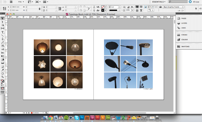
I like his comparison between indoor and outdoor lights – lights are something you can find everywhere which is why this is relevant to me as I need to find objects to take photos of in Lincoln. I notice all of his subjects are central in the photo and an amount of blank space around them. The objects are all a similar size in each photo, making the typologies look professional and pleasing to the eye.

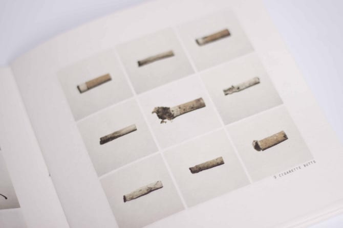
His other project, ‘Typologies of Mass Consumption’, is also very successful:

Final Small Edit Copy Cap Final Copy

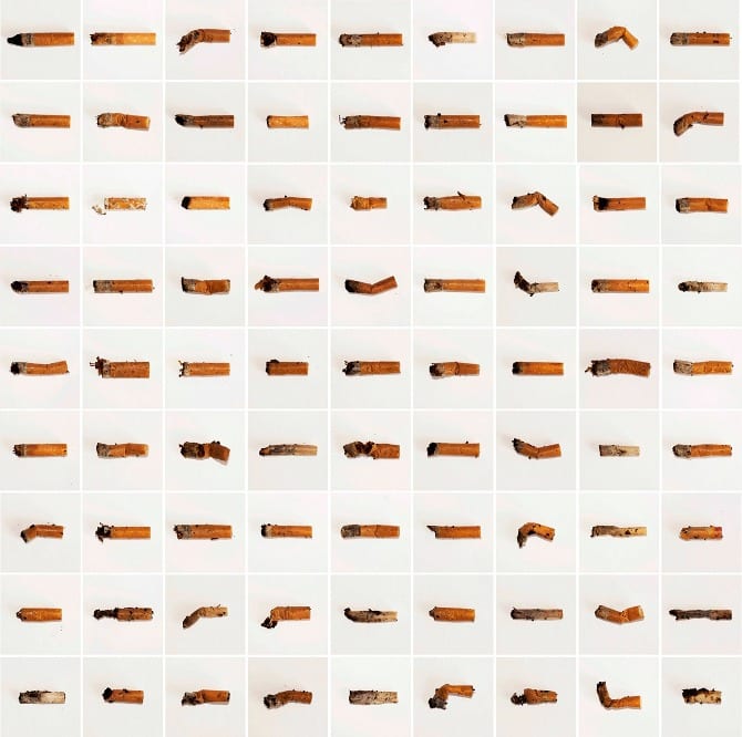
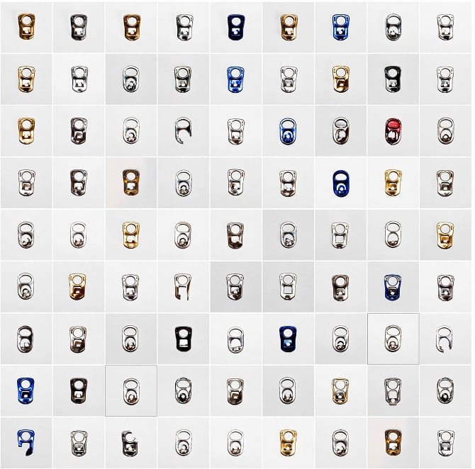
The sheer amount of can tops and cigarettes make the typologies look amazing! I like how some of the cigarettes are bent and deformed and that he has photographed them in the way that he has found them. The use of a white background in these photos also works well (even though the white varies) as it means the lines of the tops and cigarettes stand out better.

When creating my typology, I need to make sure the objects are central and fill the same amount of space in my photos, just like Steve Tyler has.

Second Studio Session

Yesterday I wanted to play around more with lighting as I have not done that so much with my photography yet. I wanted to stick with black and white as I like creating S curves with it and bringing up details on the face and shadows. Here are my best photos from yesterday:

IMG_3262


With this photo, I used two side lights to illuminate the edges of Tessa’s face but leave shadows around the nose and eyes. I like the way her cheeks are lit up but the centre of her face is darker- it gives it a spooky feel. I tried not to have too much blank space in this photo as I wanted the focus to be on the top half of Tessa.

IMG_3246


This is my favourite photo from my shoot. I love how the light is purely on Tessa’s skin and how it outlines the shape of her face. The way her hair and body then blend into the background also works very well, placing all of the attention on the face. I just used one side light in this photo as I wanted to achieve the effect where you get a distinct face outline, a bit like in this photo by Andrew Weekes:

Screen Shot 2015-11-15 at 17.41.36

IMG_3252

I really like the half light, half dark side of this photo, making it appear as though Tessa’s face is split. The half side angle also works well as you can see her expression better in this photo.


IMG_3258


I like the closeness of this photo and the way Tessa is looking at the camera – it makes it more personal. I like how her eyes glow as it is quite a dark photo and it really draws your own eyes in.

I have edited all of these photos a little, creating slight S curves on them and turning up the contrast and brightness a little. I am pleased with the outcome and will definitely be using some of these for my hand-in.

First studio session

Here are some of the portraits from my first studio session:thumb_IMG_3231_1024 thumb_IMG_3232_1024 thumb_IMG_3236_1024

  • The lighting looks nice in all of them and is not too harsh or soft.
  • Both eyes appear to be in focus in all of the photos.
  • I tried to fill the photo with Tessa instead of having a lot of blank space above her head.
  • I like the eyes looking into the camera as it draws your own eyes in more and I feel eyes are the most important feature on a face.
  • The neutral clothing works well as it does not detract attention from the face.


Here is one of the photos edited:

IMG_3232

I am trying to go for the dark, sinister and gritty look to my photos. I feel Tessa looks as though she has come from underground in this photo but I love how her eyes look piercing. I am not sure if it is too dark and may have to get some opinions on it before I submit this photo though.


Andrew Weekes

In terms of portraiture, I really like the gritty, grainy, dirty looking black and white photos. After talking to someone on the graphic design course at Lincoln, they told me about a photographer called Andrew Weekes who takes beautiful portraits of often very famous people.

Since typing this first paragraph and saving it, Andrew came in and did a workshop with our class. His story of photography from war to schools is amazing and here are some of his portraits from his black and white series that I like the most:

Screen Shot 2015-11-15 at 17.41.17

Screen Shot 2015-11-15 at 17.41.59


  • I love how close and detailed these portraits are
  • You need an interesting face with wrinkles or freckles to make photos like this interesting
  • I love the man’s eyes in the photo – they are all bright and full of life
  • The black background works well as a contrast with the face
  • I think Andrew made an S curve to create these

Screen Shot 2015-11-15 at 17.41.36

I like this photo as it is different from the rest. The way Ed is looking into the light seems to be metaphorical with him facing the cameras and light whilst he was the leader for Labour. I also like how you can just make out the back of his head but apart from that, it is just his face and suit that are in the light. It is quite a dark photo, I presume with only one front light used, but it is very interesting and definitely something I will try.

Richard Avedon

Richard Avedon is a photographer who was brought up in a lecture during our first year at university. Similar to Andrew Weekes, I appreciate the high contrast and gritty feel to his photos. The way he has edited and lit the photos bring out all of the details in his subject’s faces – their freckles and eyes look incredible. The style of photo that he creates is something that I would like to attempt as I believe they are more interesting than just a standard, coloured portrait.

His American West photo collection are my favourite as the people are all incredibly interesting to look at and have different facial features that are accentuated with his style. The photos initially caused an outrage when he first released them as America was used to ‘the West’ being romanticised, however his photos documented what ‘the West’ was really like. The awkward poses are more life-like instead of the silly poses you find in editorial magazines which is also why they stand out to me.

richard_avedon_girl

This is my favourite photo from the collection. The freckles on the girl’s face are the most interesting part – I love how this style brings them out. Blue eyes also seem to look better in black and white with high contrast and lighting so I will try and take some photos of people with blue eyes when I take my photos.

In-the-American-West_04

The clothing is what caught my eye in this photo – I love how the way the photo has been edited makes the checks more distinct. I like the usage of patterned clothing in this photo and also like how the man looks a bit more scruffy and dirty – it looks more interesting than him being plain and boring.

The white background works well and I think I may attempt some medium shots with a white background like this photo collection.