Monthly Archives: November 2015
Pinterest Typologies
Instead of finding an individual photographer, I thought I would just have a look at some typologies that I like on Pinterest:
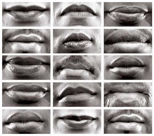
- I like how this is black and white – it is a classification of lip shape instead of colour of anything else
- The lips are all relatively central
- The fact there is 15 different photos means there is quite a few to compare
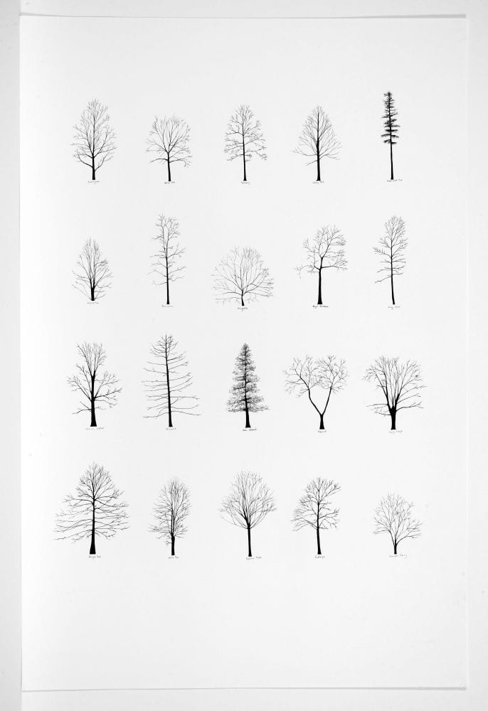
- I love the simplicity of this
- The black and white works well
- The trees tend to be in an order of shorter – taller – shorter
- There is a lot of white space around the trees
- Simple but works well
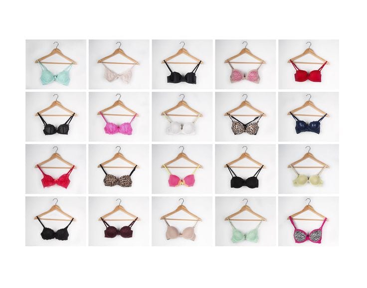
- I like the large variety of colours
- Same hanger makes it look better
- All central
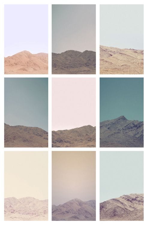
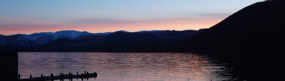
- The mountain itself is not very exciting but the various shades of colour are
- Colours compliment each other
- Mountains are at bottom of photo – perhaps indicating the sky is the important part
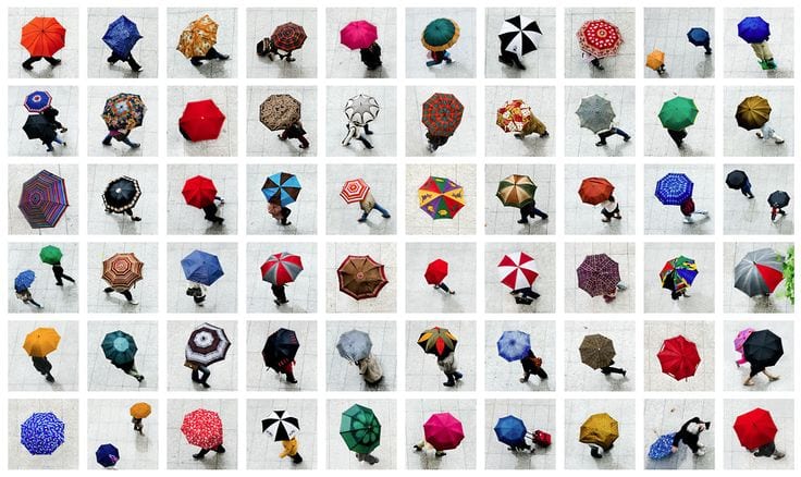
- Lots of umbrellas makes this pleasing to the eye
- Large variety of colours looks good
- All central
- Taken from above – best angle for umbrellas
- Something I could attempt?
Steve Tyler
When I first saw that we had to create a typology of Lincoln, I was quite excited as they are one of the best types of photography to look at. I also want to revisit typology as I attempted it last year but it did not go particularly well – I took photos of different coloured houses but I did not quite frame them all the same in my photos.
When researching typology, I wanted to find a photographer who creates typologies using things you could find in a town or on a street, as our typology has to be on Lincoln. I found a man called Steve Tyler, a recent graduate, and here are some of his typologies from his collection ‘Typology in Common Places’ that I particularly like:
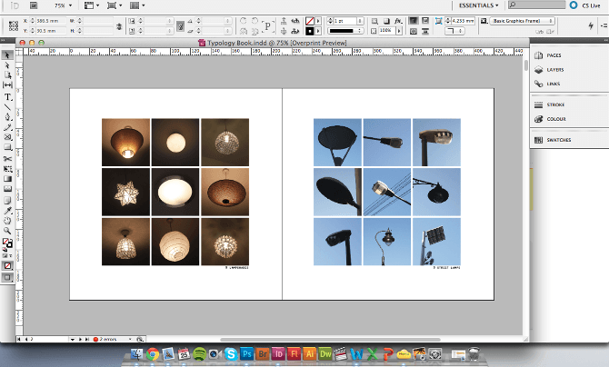
I like his comparison between indoor and outdoor lights – lights are something you can find everywhere which is why this is relevant to me as I need to find objects to take photos of in Lincoln. I notice all of his subjects are central in the photo and an amount of blank space around them. The objects are all a similar size in each photo, making the typologies look professional and pleasing to the eye.
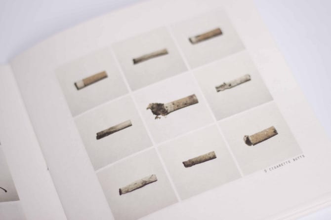
His other project, ‘Typologies of Mass Consumption’, is also very successful:
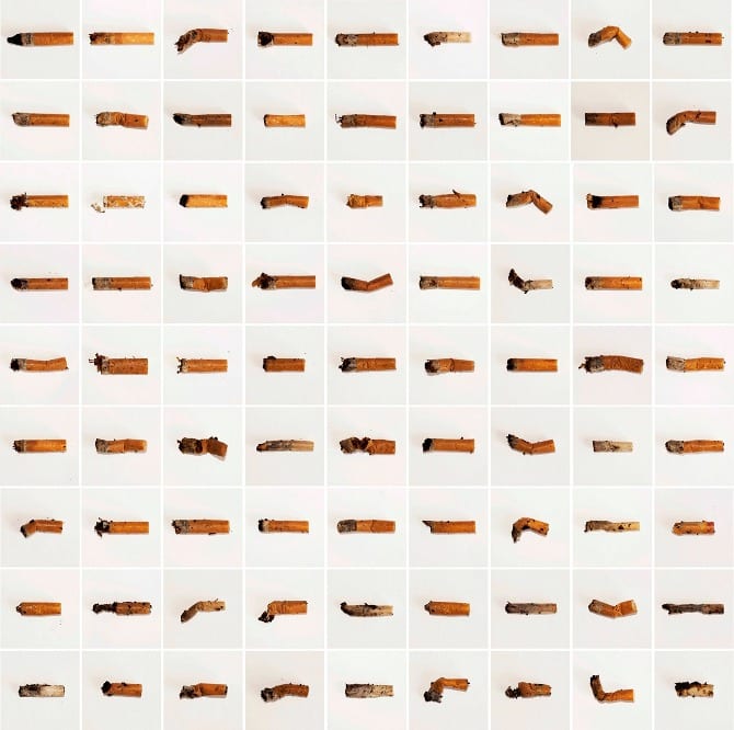
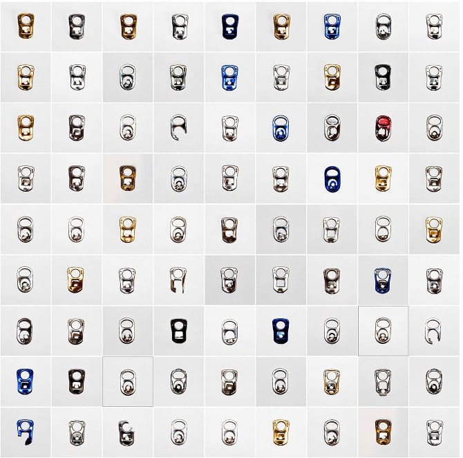
The sheer amount of can tops and cigarettes make the typologies look amazing! I like how some of the cigarettes are bent and deformed and that he has photographed them in the way that he has found them. The use of a white background in these photos also works well (even though the white varies) as it means the lines of the tops and cigarettes stand out better.
When creating my typology, I need to make sure the objects are central and fill the same amount of space in my photos, just like Steve Tyler has.
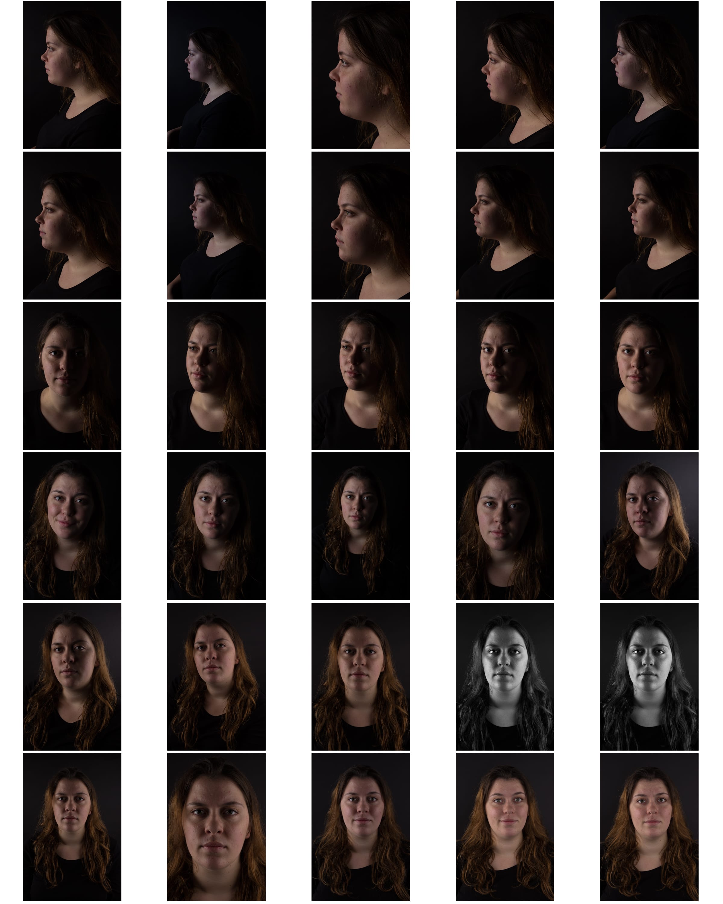
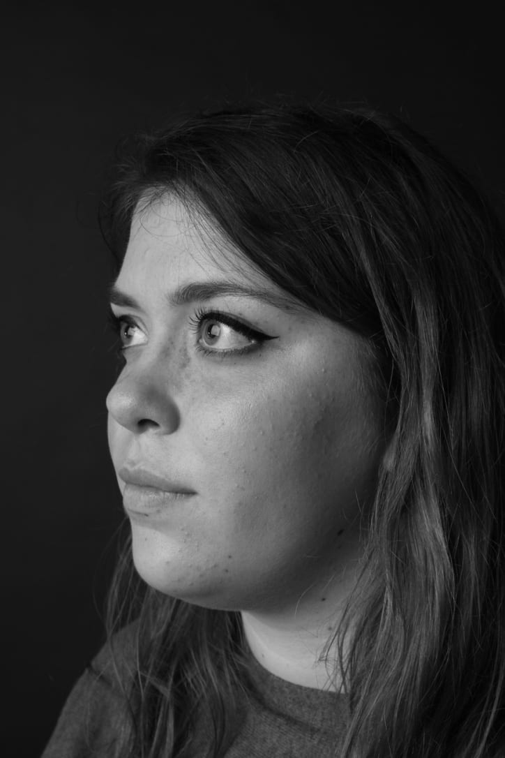
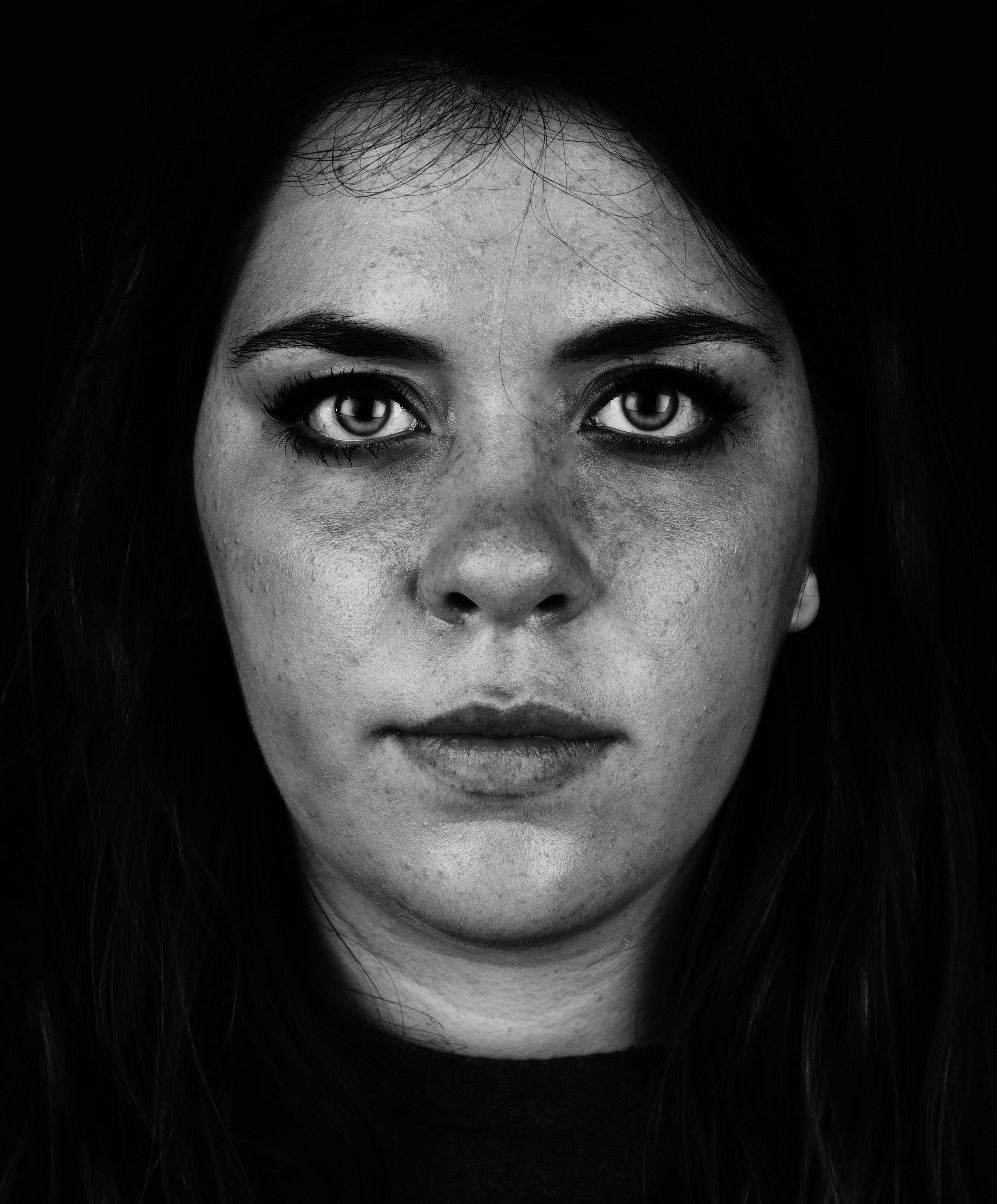
Second Studio Session
Yesterday I wanted to play around more with lighting as I have not done that so much with my photography yet. I wanted to stick with black and white as I like creating S curves with it and bringing up details on the face and shadows. Here are my best photos from yesterday:
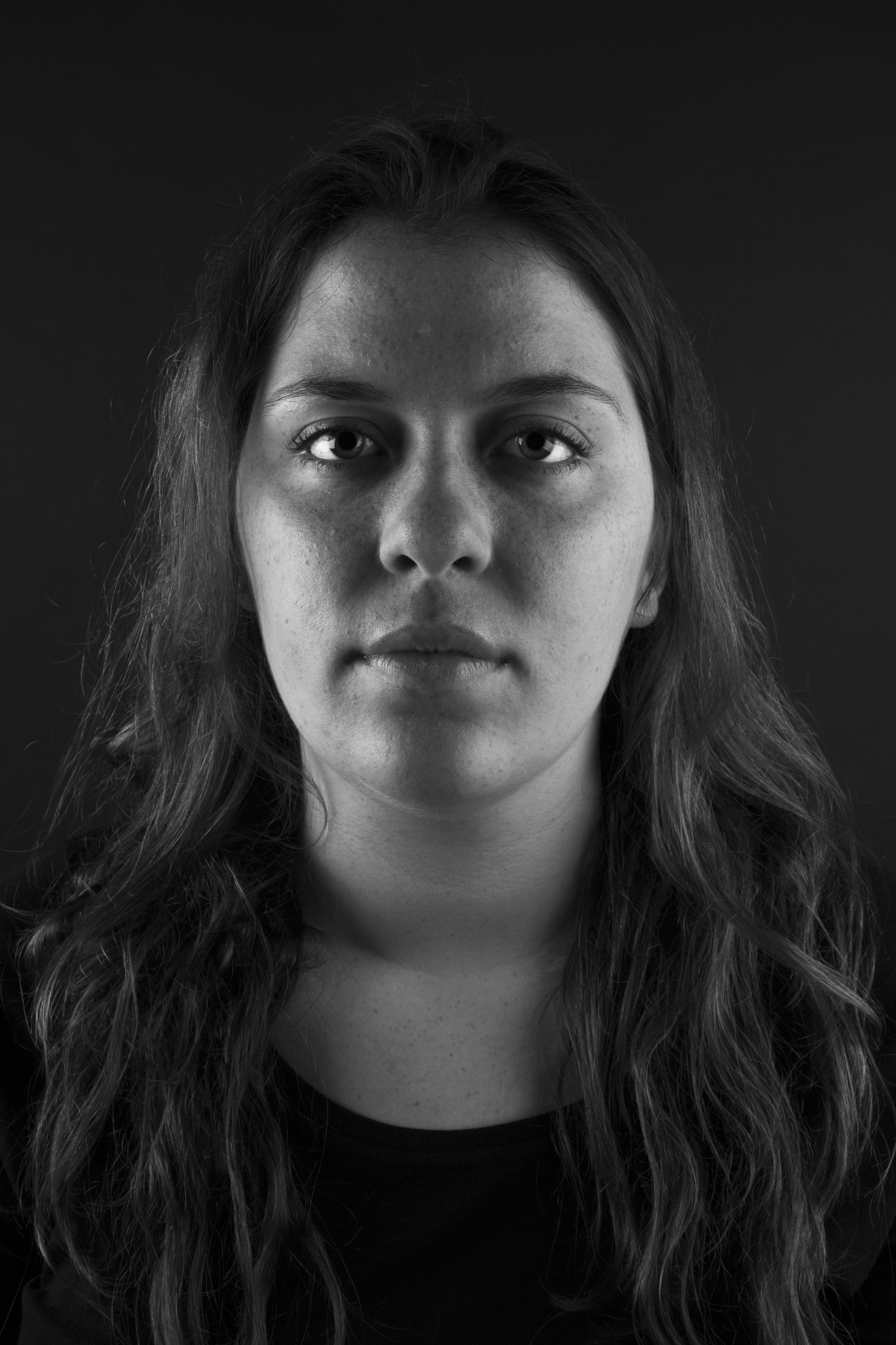
With this photo, I used two side lights to illuminate the edges of Tessa’s face but leave shadows around the nose and eyes. I like the way her cheeks are lit up but the centre of her face is darker- it gives it a spooky feel. I tried not to have too much blank space in this photo as I wanted the focus to be on the top half of Tessa.
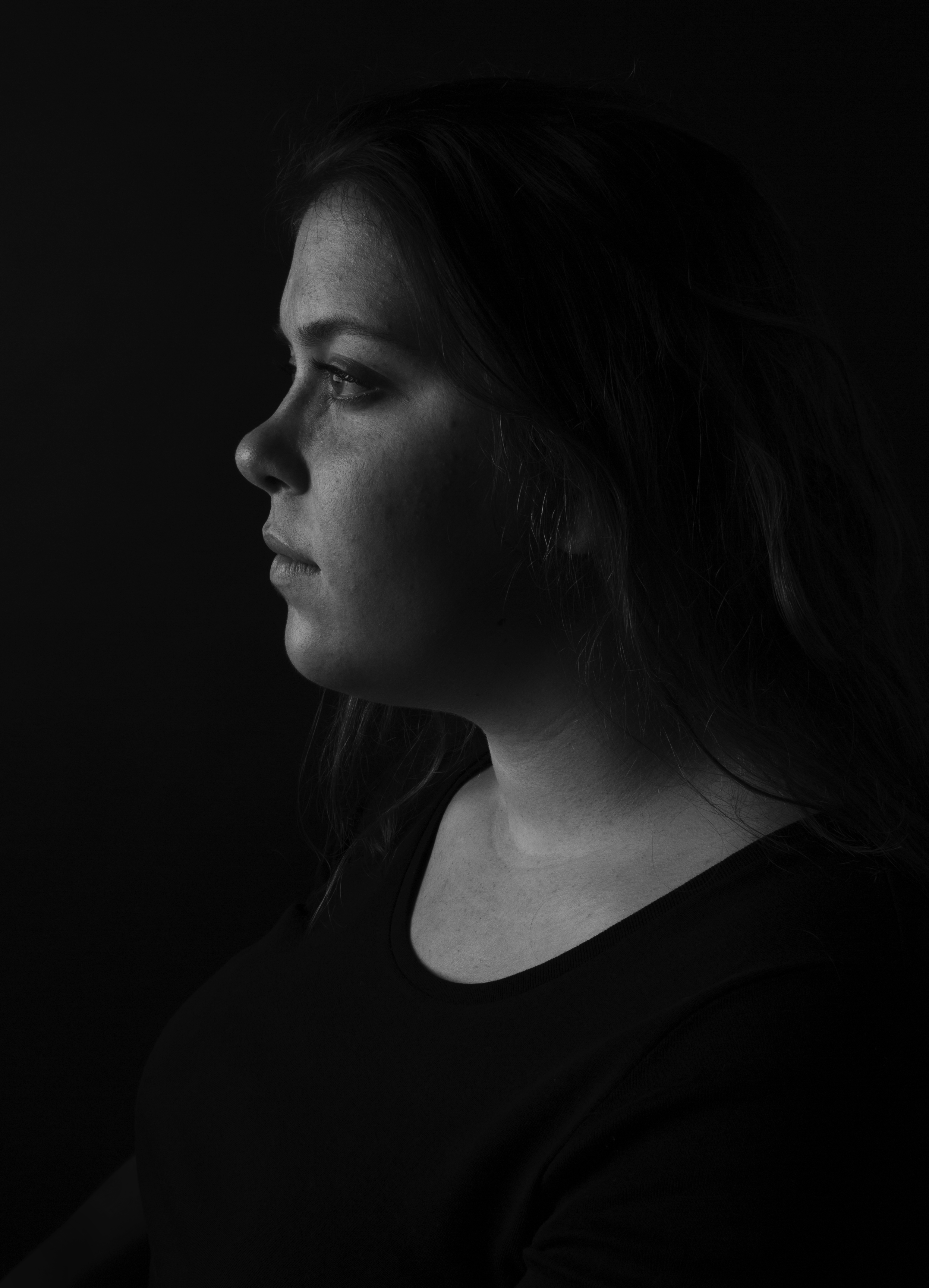
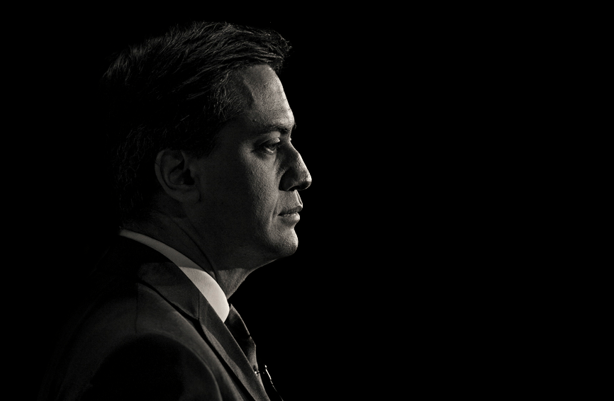
This is my favourite photo from my shoot. I love how the light is purely on Tessa’s skin and how it outlines the shape of her face. The way her hair and body then blend into the background also works very well, placing all of the attention on the face. I just used one side light in this photo as I wanted to achieve the effect where you get a distinct face outline, a bit like in this photo by Andrew Weekes:
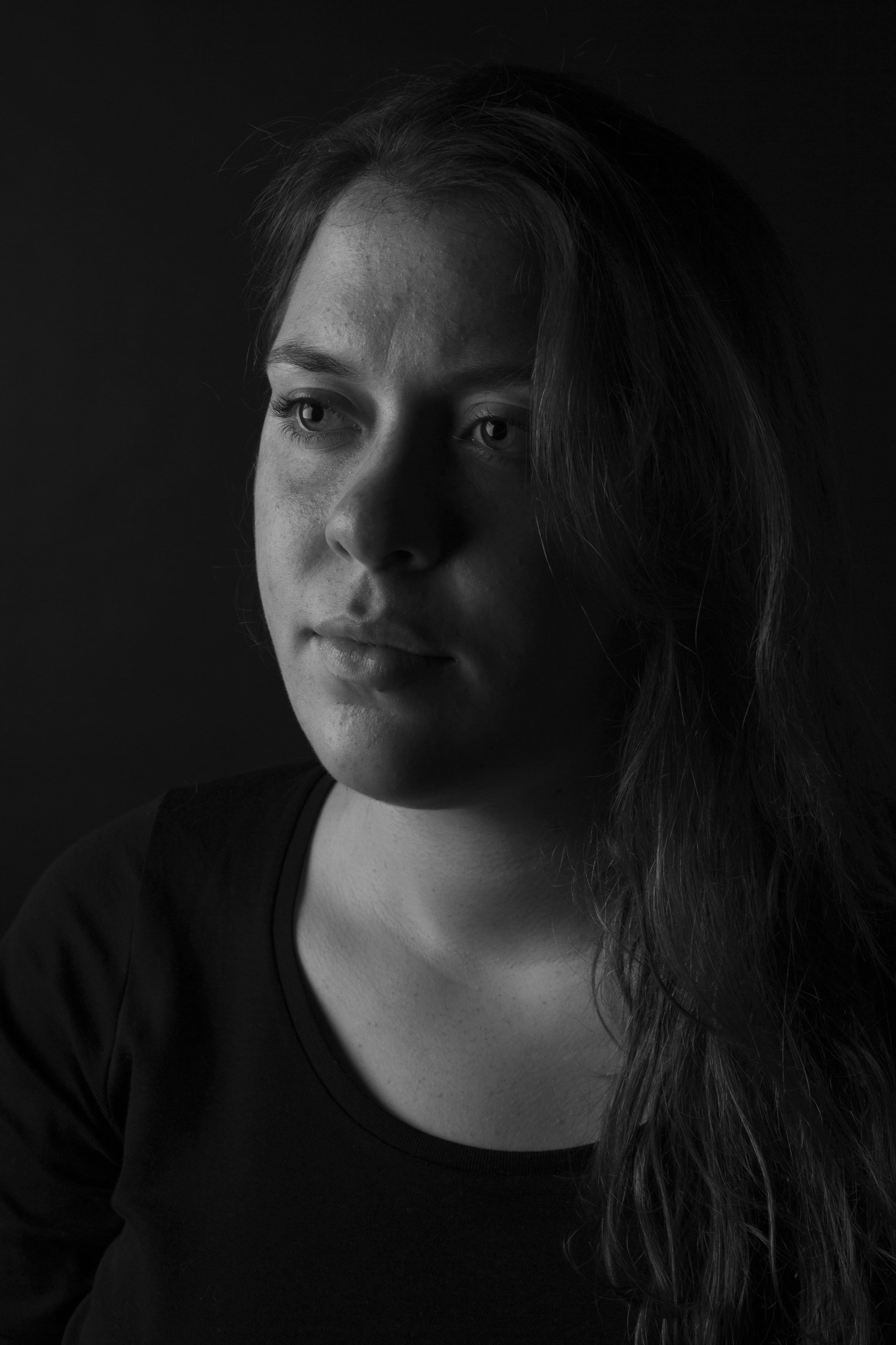
I really like the half light, half dark side of this photo, making it appear as though Tessa’s face is split. The half side angle also works well as you can see her expression better in this photo.
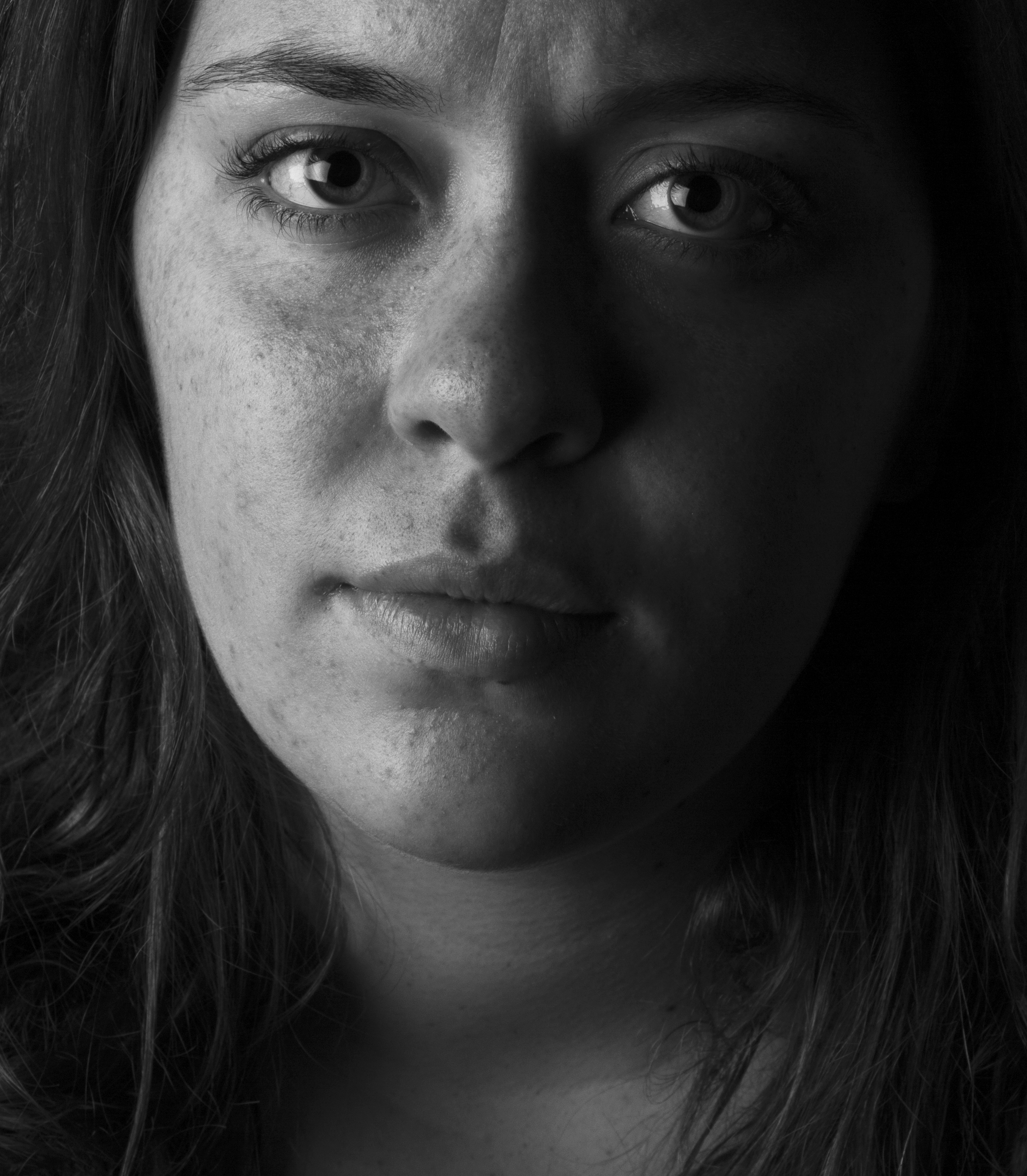
I like the closeness of this photo and the way Tessa is looking at the camera – it makes it more personal. I like how her eyes glow as it is quite a dark photo and it really draws your own eyes in.
I have edited all of these photos a little, creating slight S curves on them and turning up the contrast and brightness a little. I am pleased with the outcome and will definitely be using some of these for my hand-in.
First studio session
Here are some of the portraits from my first studio session: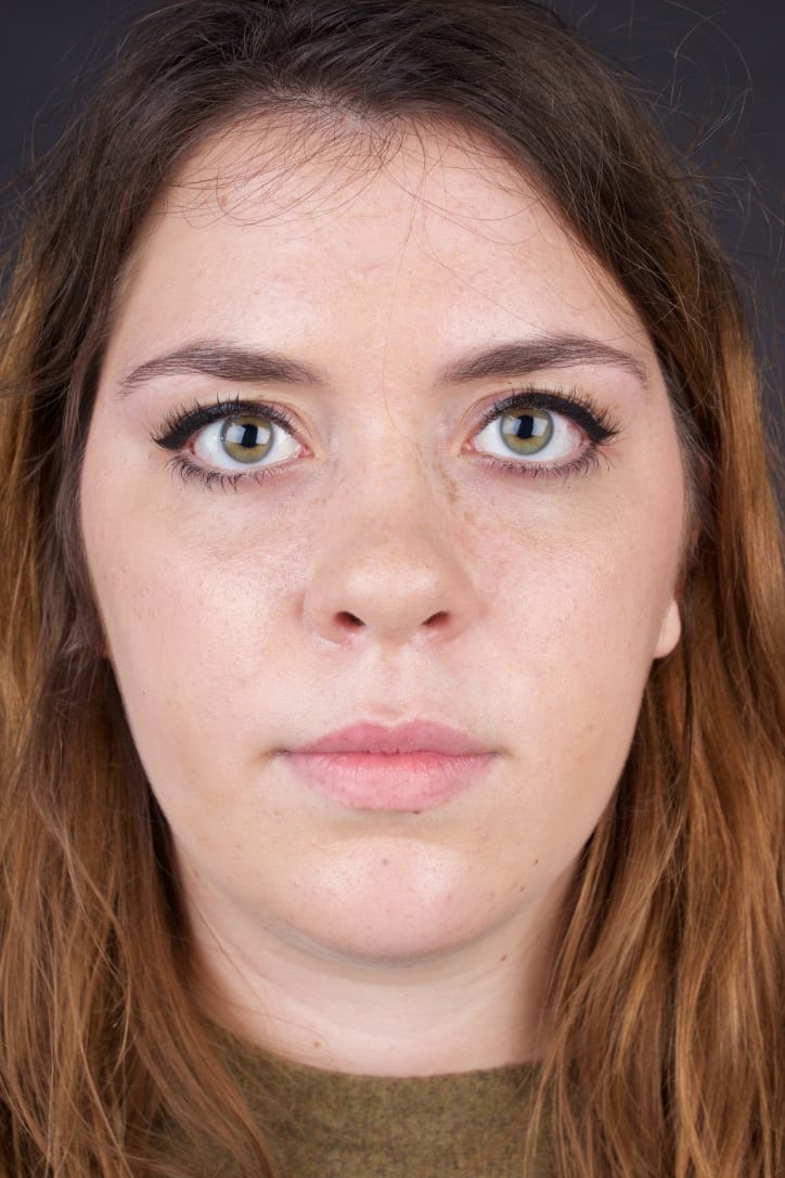
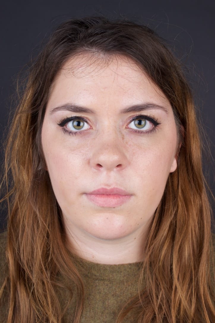
- The lighting looks nice in all of them and is not too harsh or soft.
- Both eyes appear to be in focus in all of the photos.
- I tried to fill the photo with Tessa instead of having a lot of blank space above her head.
- I like the eyes looking into the camera as it draws your own eyes in more and I feel eyes are the most important feature on a face.
- The neutral clothing works well as it does not detract attention from the face.
Here is one of the photos edited:
I am trying to go for the dark, sinister and gritty look to my photos. I feel Tessa looks as though she has come from underground in this photo but I love how her eyes look piercing. I am not sure if it is too dark and may have to get some opinions on it before I submit this photo though.