Not-so-golden oldies

You may be thinking while reading my blog that I have not particularly included much with a historical context. There is a reason for this.
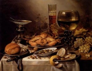
For the first blog, as I explained in my sketchbook for photography last year, I hate the old, pained still life pictures. A fine example of one being this:

d5776c6893a179867deaa9c0659d4299

This is a painting by Pieter Claesz and I do believe he was a rather famous Dutch painter. However, I thoroughly dislike how dull this painting is. There is a severe lack of colour in it and the most commonly used colour appears to be brown. I know the objects have been arranged and the man probably spent hours thinking about it but they just look like such a mess and it is not my sort of thing.

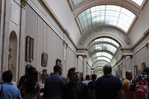
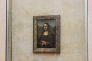
For portraiture, I did not particularly cover paintings either. I have been to see the Mona Lisa but it was probably more just because it is famous and not for the actual portrait itself.

IMG_2464 IMG_2468


I think the reason I am not particularly interested in painted portraits is that it is not something I can particularly achieve myself – I can take a photo of someone’s face but I definitely could not paint one, or not well anyway. There is no doubt that the lighting in painted portraits and positions in which people sit have been an inspiration and have heavily influenced certain photographers, but I find more current things are more relevant for me.

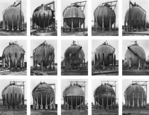
As for typologies, I have previously looked at Bernd & Becher and their study of types. I do like how unusual their typologies are, like their ‘Cooling Towers’ piece which sold for a $150,000 in 2004! I think they showed how it is a way of making a boring subject more interesting by being able to compare it to others.

bernd-hilla-becher-gas-tanks_1983-92

Second Studio Session

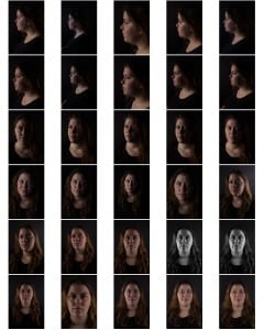
Yesterday I wanted to play around more with lighting as I have not done that so much with my photography yet. I wanted to stick with black and white as I like creating S curves with it and bringing up details on the face and shadows. Here are my best photos from yesterday:

IMG_3262


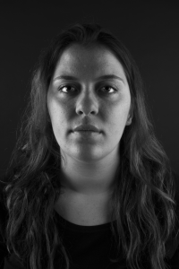
With this photo, I used two side lights to illuminate the edges of Tessa’s face but leave shadows around the nose and eyes. I like the way her cheeks are lit up but the centre of her face is darker- it gives it a spooky feel. I tried not to have too much blank space in this photo as I wanted the focus to be on the top half of Tessa.

IMG_3246


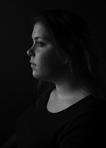
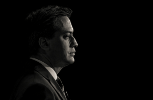
This is my favourite photo from my shoot. I love how the light is purely on Tessa’s skin and how it outlines the shape of her face. The way her hair and body then blend into the background also works very well, placing all of the attention on the face. I just used one side light in this photo as I wanted to achieve the effect where you get a distinct face outline, a bit like in this photo by Andrew Weekes:

Screen Shot 2015-11-15 at 17.41.36

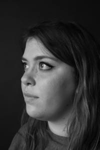
IMG_3252

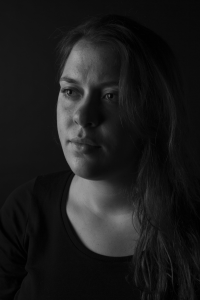
I really like the half light, half dark side of this photo, making it appear as though Tessa’s face is split. The half side angle also works well as you can see her expression better in this photo.


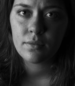
IMG_3258


I like the closeness of this photo and the way Tessa is looking at the camera – it makes it more personal. I like how her eyes glow as it is quite a dark photo and it really draws your own eyes in.

I have edited all of these photos a little, creating slight S curves on them and turning up the contrast and brightness a little. I am pleased with the outcome and will definitely be using some of these for my hand-in.

First studio session

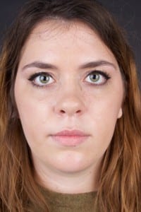
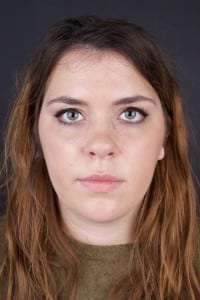
Here are some of the portraits from my first studio session:thumb_IMG_3231_1024 thumb_IMG_3232_1024 thumb_IMG_3236_1024

  • The lighting looks nice in all of them and is not too harsh or soft.
  • Both eyes appear to be in focus in all of the photos.
  • I tried to fill the photo with Tessa instead of having a lot of blank space above her head.
  • I like the eyes looking into the camera as it draws your own eyes in more and I feel eyes are the most important feature on a face.
  • The neutral clothing works well as it does not detract attention from the face.


Here is one of the photos edited:

IMG_3232

I am trying to go for the dark, sinister and gritty look to my photos. I feel Tessa looks as though she has come from underground in this photo but I love how her eyes look piercing. I am not sure if it is too dark and may have to get some opinions on it before I submit this photo though.


Andrew Weekes

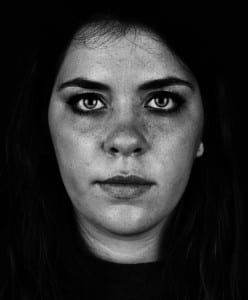
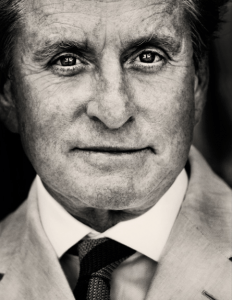
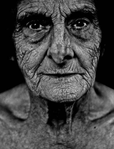
In terms of portraiture, I really like the gritty, grainy, dirty looking black and white photos. After talking to someone on the graphic design course at Lincoln, they told me about a photographer called Andrew Weekes who takes beautiful portraits of often very famous people.

Since typing this first paragraph and saving it, Andrew came in and did a workshop with our class. His story of photography from war to schools is amazing and here are some of his portraits from his black and white series that I like the most:

Screen Shot 2015-11-15 at 17.41.17

Screen Shot 2015-11-15 at 17.41.59


  • I love how close and detailed these portraits are
  • You need an interesting face with wrinkles or freckles to make photos like this interesting
  • I love the man’s eyes in the photo – they are all bright and full of life
  • The black background works well as a contrast with the face
  • I think Andrew made an S curve to create these

Screen Shot 2015-11-15 at 17.41.36

I like this photo as it is different from the rest. The way Ed is looking into the light seems to be metaphorical with him facing the cameras and light whilst he was the leader for Labour. I also like how you can just make out the back of his head but apart from that, it is just his face and suit that are in the light. It is quite a dark photo, I presume with only one front light used, but it is very interesting and definitely something I will try.