Not-so-golden oldies

You may be thinking while reading my blog that I have not particularly included much with a historical context. There is a reason for this.
For the first blog, as I explained in my sketchbook for photography last year, I hate the old, pained still life pictures. A fine example of one being this:

d5776c6893a179867deaa9c0659d4299

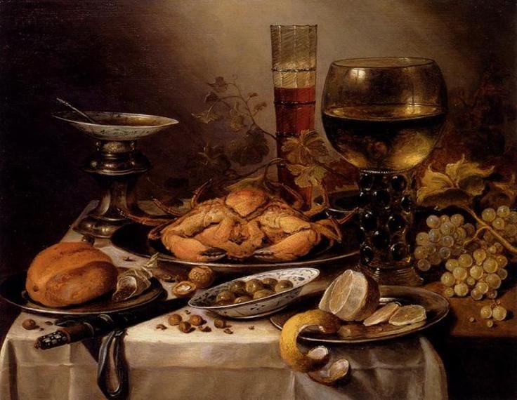
This is a painting by Pieter Claesz and I do believe he was a rather famous Dutch painter. However, I thoroughly dislike how dull this painting is. There is a severe lack of colour in it and the most commonly used colour appears to be brown. I know the objects have been arranged and the man probably spent hours thinking about it but they just look like such a mess and it is not my sort of thing.

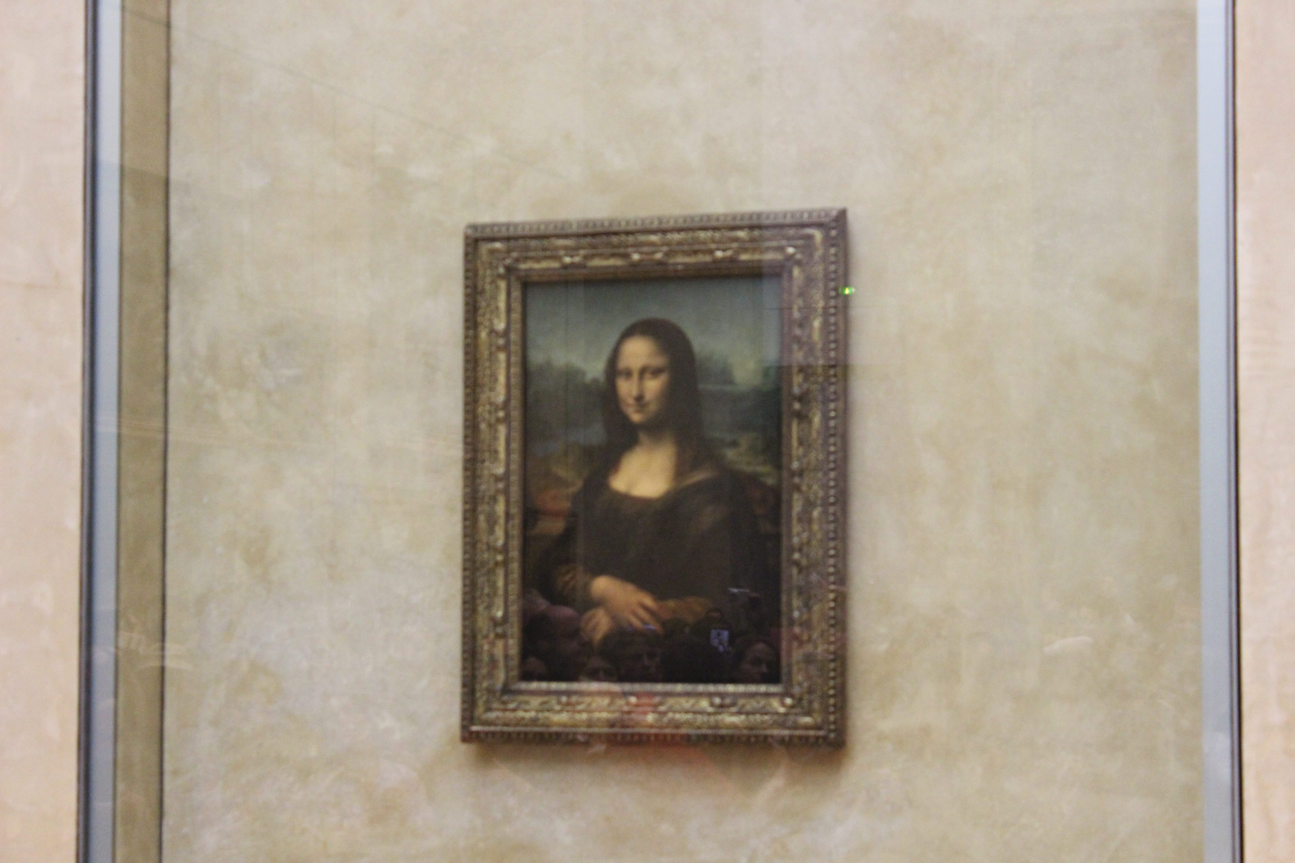
For portraiture, I did not particularly cover paintings either. I have been to see the Mona Lisa but it was probably more just because it is famous and not for the actual portrait itself.

IMG_2464 IMG_2468


I think the reason I am not particularly interested in painted portraits is that it is not something I can particularly achieve myself – I can take a photo of someone’s face but I definitely could not paint one, or not well anyway. There is no doubt that the lighting in painted portraits and positions in which people sit have been an inspiration and have heavily influenced certain photographers, but I find more current things are more relevant for me.

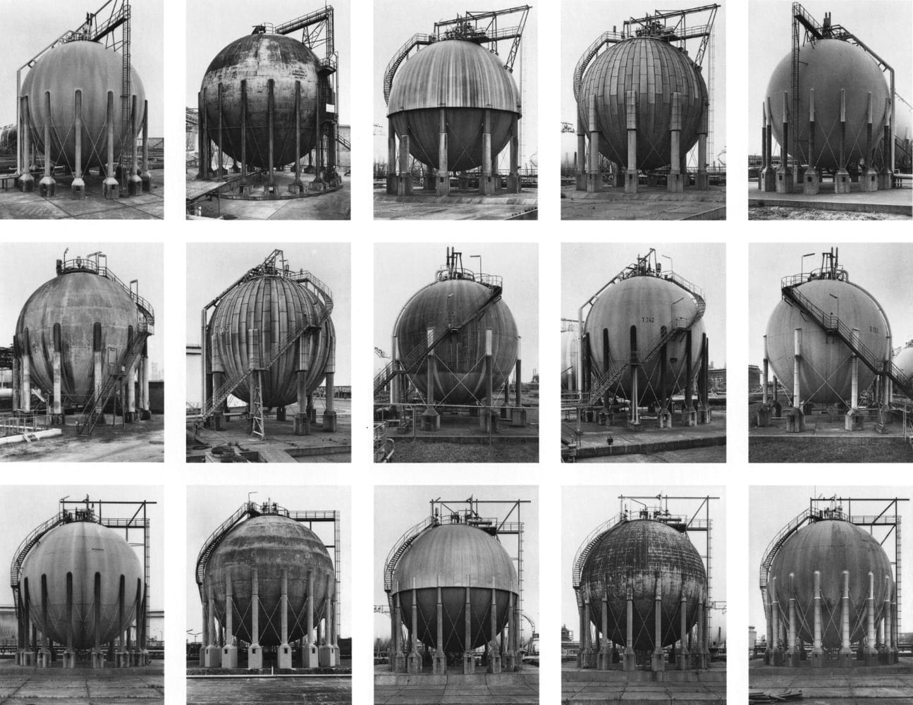
As for typologies, I have previously looked at Bernd & Becher and their study of types. I do like how unusual their typologies are, like their ‘Cooling Towers’ piece which sold for a $150,000 in 2004! I think they showed how it is a way of making a boring subject more interesting by being able to compare it to others.

bernd-hilla-becher-gas-tanks_1983-92

Second thoughts and final submission

So for my first project I was specifically going for a Toiletpaper look, which I think paid off looking at the photos below this post. The central framing, the bright colours, the random subjects and just about every aspect of the photos fits with Toiletpaper, which I am incredibly pleased with. Now that I have grasped the basics of using the studio, I hope that it will not take so long to complete the rest of my projects. I also learnt in the lesson that we just need a couple of clear influences and a few blogs on process – not as many as I have been doing!

Photos for my final submission:
thumb_IMG_2937_1024-2
Things that work with this photo:

  • The pastel colours contrasting with the bright sweets
  • The framing of the clamp and the sweets
  • The idea of the sweets being compressed
  • The randomness of the photo

thumb_IMG_2928_1024-2
Things that worked well with this photo:

  • The bright, contrasting colours
  • The fact the hammer blue is a lighter shade
  • The difference between the colours in the middle
  • The positioning of the hammer


thumb_IMG_2921_1024-3


thumb_IMG_2925_1024

Things that I like about theses:

  • I love how the baguette/fish substitute a leg
  • The interesting patterns on my shoe
  • The fact it plays on squeaky clean advertisement photography
  • The odd colour combinations
  • The textures of the bread/fish and my shoes
  • I can incorporate it in my next project for creatures

I do not like:

  • The dirt on the bottom of my shoe (I tried to edit this out but it just looked fake)

Do they fit?

To be fully happy with my final photos, I had to make sure that they would fit with the magazine style of Toiletpaper. Here are a few of my photos placed as the front cover of the Toiletpaper magazine (I realised the landscapes do not fit so well so I cut the bottom of the photos off:

Screen Shot 2015-10-21 at 16.51.47

Screen Shot 2015-10-21 at 16.52.24

Screen Shot 2015-10-21 at 16.52.51

I am very pleased with my outcome and feel my photos work well in terms of colour and weirdness.

Final Submission

Before you ask, I intentionally turned up the contrast in these photos:
thumb_IMG_2923_1024 thumb_IMG_2921_1024-2
The cheese looked a little bland set at the normal contrast levels and the green background was not bright enough, but with turning up the contrast, it made the photos make far more interesting.

I turned down the saturation a little in these photos:thumb_IMG_2928_1024 thumb_IMG_2937_1024

I like the softness of these photos and feel they would work well on the front cover of Toiletpaper.

I really like how my second attempt of the sweet photo worked:
thumb_IMG_2944_1024
The sugar next to the sweets reminds the audience that the photo is of real food, and then I love how the colours contrast.