Before you ask, I intentionally turned up the contrast in these photos:
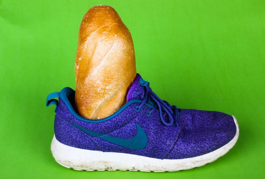
The cheese looked a little bland set at the normal contrast levels and the green background was not bright enough, but with turning up the contrast, it made the photos make far more interesting.
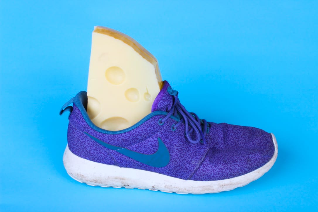
I turned down the saturation a little in these photos:
I like the softness of these photos and feel they would work well on the front cover of Toiletpaper.
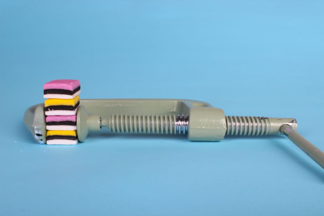
I really like how my second attempt of the sweet photo worked:
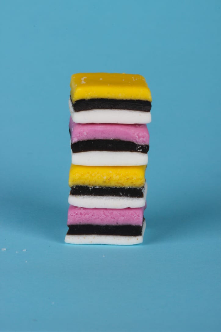
The sugar next to the sweets reminds the audience that the photo is of real food, and then I love how the colours contrast.