So for my first project I was specifically going for a Toiletpaper look, which I think paid off looking at the photos below this post. The central framing, the bright colours, the random subjects and just about every aspect of the photos fits with Toiletpaper, which I am incredibly pleased with. Now that I have grasped the basics of using the studio, I hope that it will not take so long to complete the rest of my projects. I also learnt in the lesson that we just need a couple of clear influences and a few blogs on process – not as many as I have been doing!
Photos for my final submission:
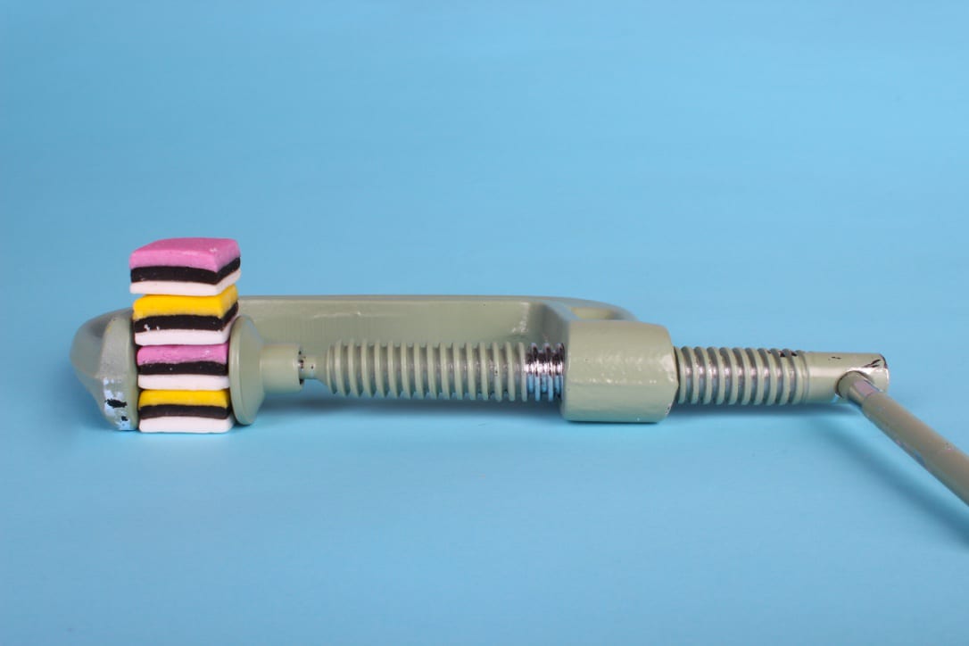
Things that work with this photo:
- The pastel colours contrasting with the bright sweets
- The framing of the clamp and the sweets
- The idea of the sweets being compressed
- The randomness of the photo
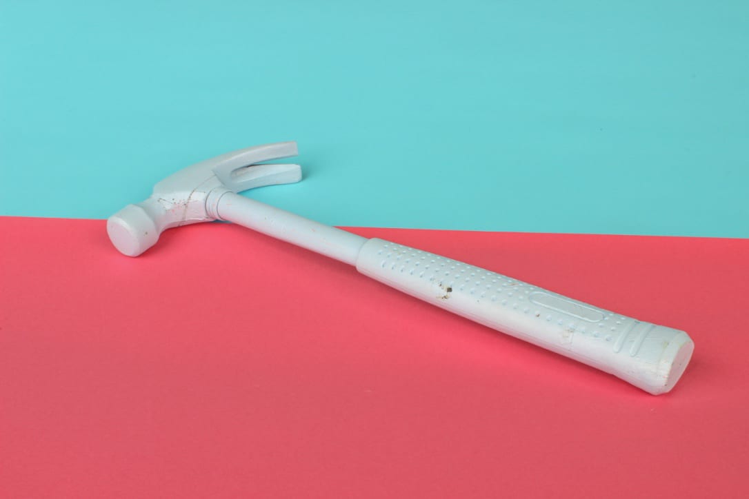
Things that worked well with this photo:
- The bright, contrasting colours
- The fact the hammer blue is a lighter shade
- The difference between the colours in the middle
- The positioning of the hammer
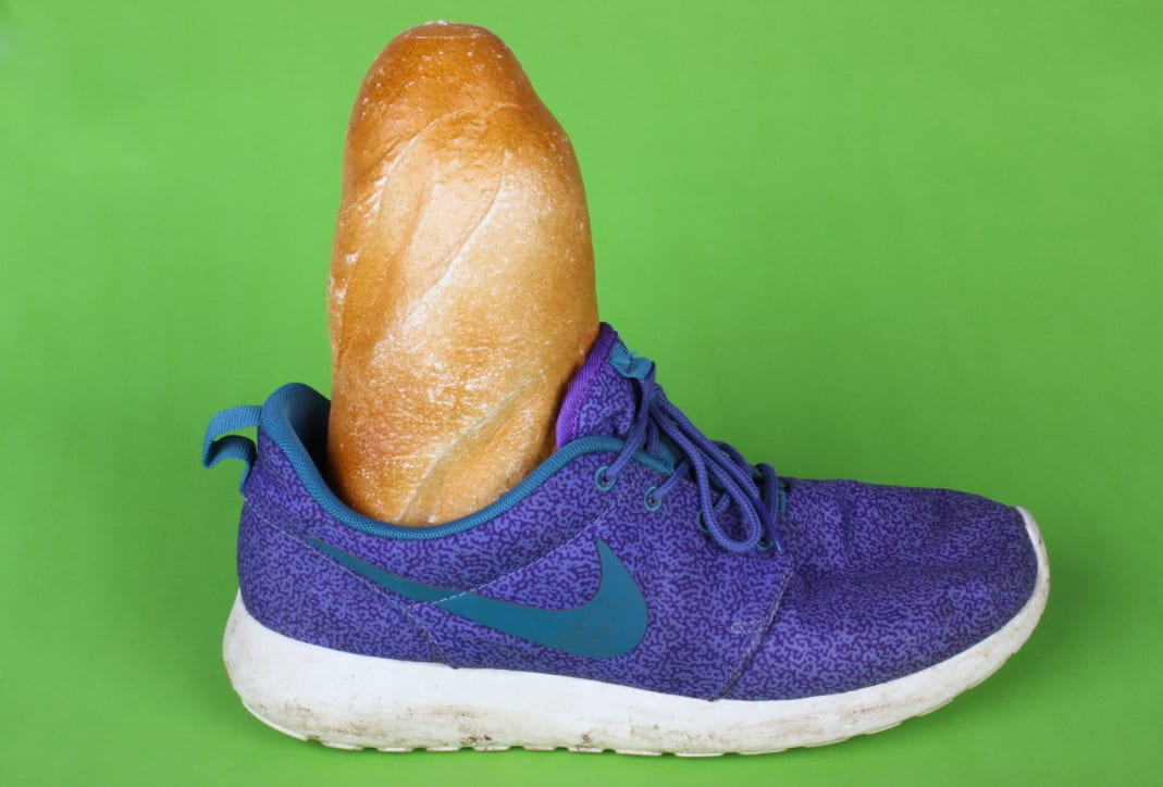
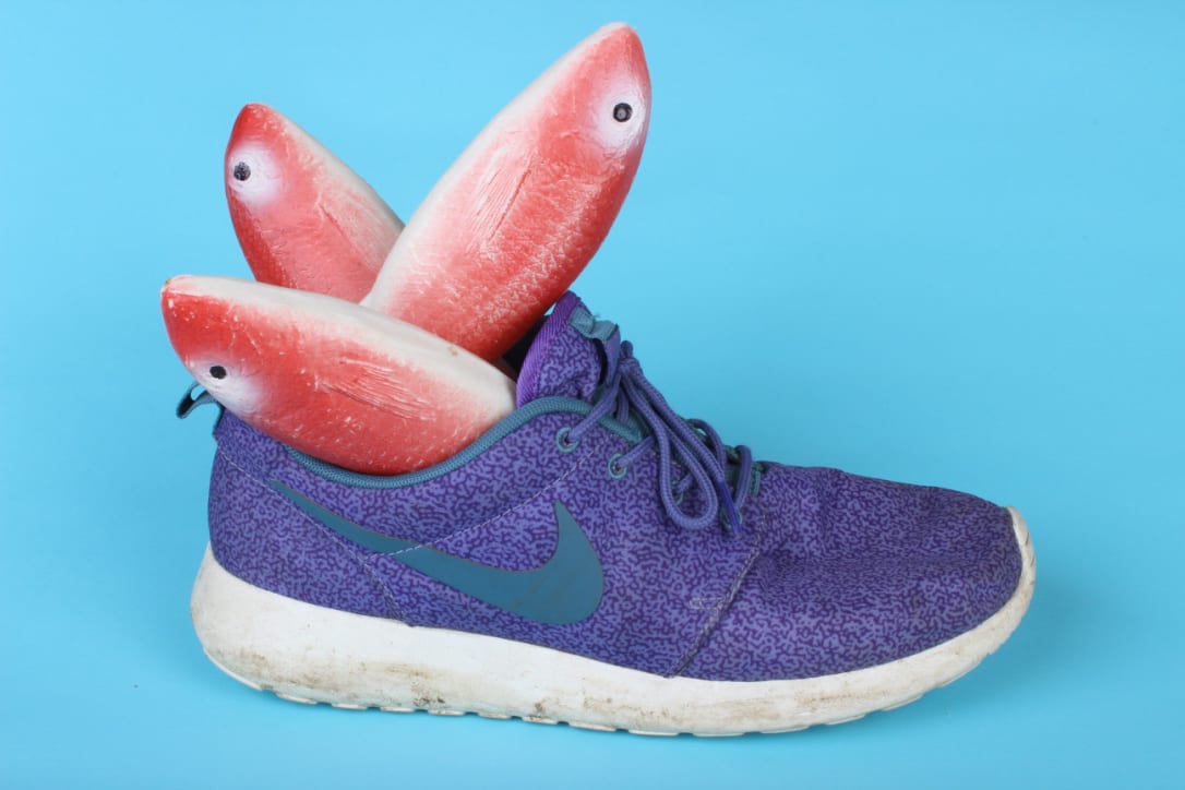
Things that I like about theses:
- I love how the baguette/fish substitute a leg
- The interesting patterns on my shoe
- The fact it plays on squeaky clean advertisement photography
- The odd colour combinations
- The textures of the bread/fish and my shoes
- I can incorporate it in my next project for creatures
I do not like:
- The dirt on the bottom of my shoe (I tried to edit this out but it just looked fake)