Andrew Weekes

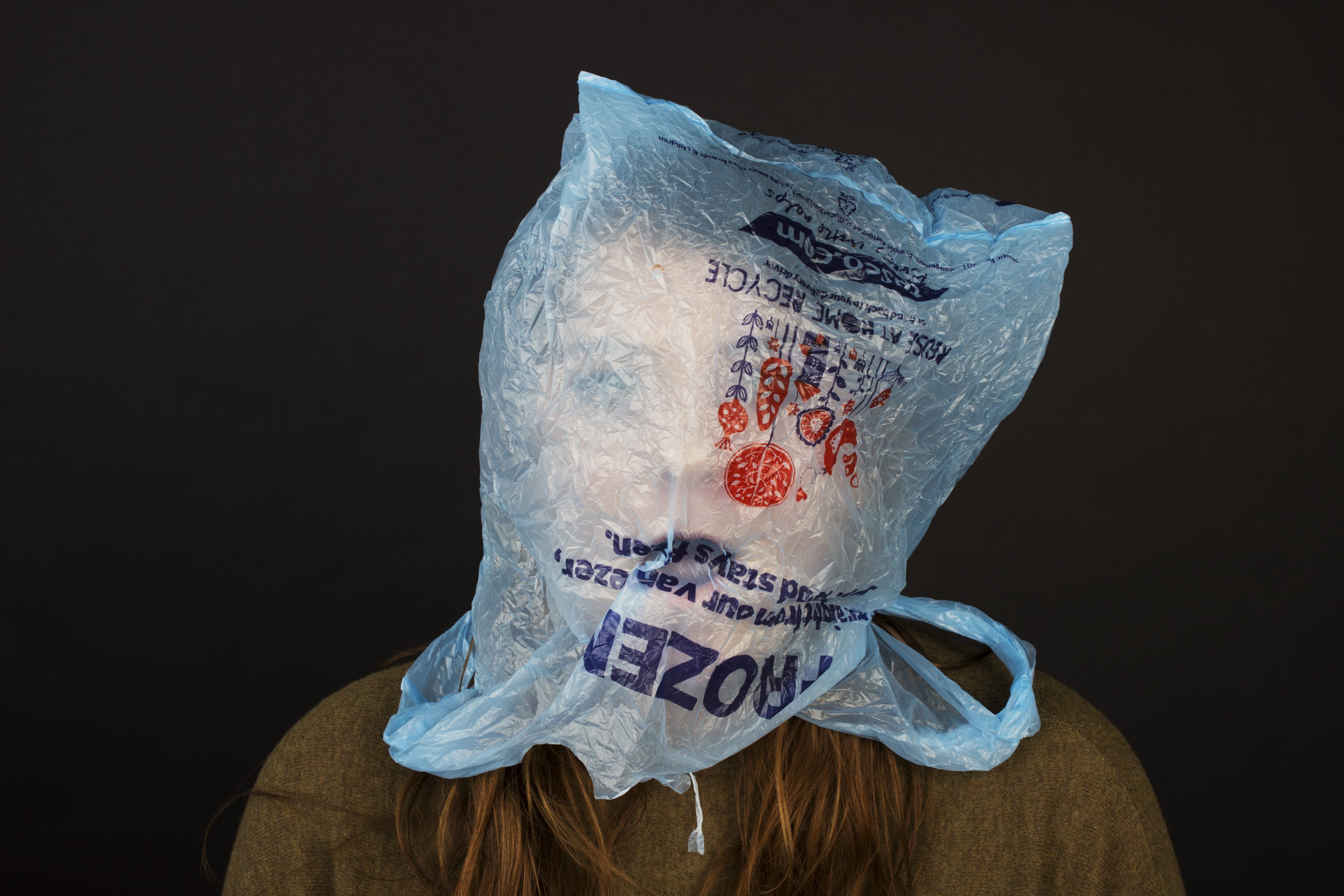
In terms of portraiture, I really like the gritty, grainy, dirty looking black and white photos. After talking to someone on the graphic design course at Lincoln, they told me about a photographer called Andrew Weekes who takes beautiful portraits of often very famous people.

Since typing this first paragraph and saving it, Andrew came in and did a workshop with our class. His story of photography from war to schools is amazing and here are some of his portraits from his black and white series that I like the most:

Screen Shot 2015-11-15 at 17.41.17

Screen Shot 2015-11-15 at 17.41.59


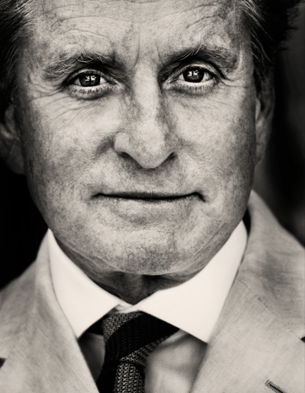
  • I love how close and detailed these portraits are
  • You need an interesting face with wrinkles or freckles to make photos like this interesting
  • I love the man’s eyes in the photo – they are all bright and full of life
  • The black background works well as a contrast with the face
  • I think Andrew made an S curve to create these

Screen Shot 2015-11-15 at 17.41.36

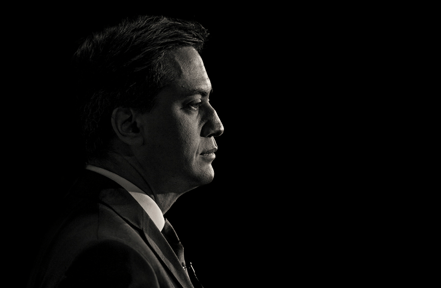
I like this photo as it is different from the rest. The way Ed is looking into the light seems to be metaphorical with him facing the cameras and light whilst he was the leader for Labour. I also like how you can just make out the back of his head but apart from that, it is just his face and suit that are in the light. It is quite a dark photo, I presume with only one front light used, but it is very interesting and definitely something I will try.

Richard Avedon

Richard Avedon is a photographer who was brought up in a lecture during our first year at university. Similar to Andrew Weekes, I appreciate the high contrast and gritty feel to his photos. The way he has edited and lit the photos bring out all of the details in his subject’s faces – their freckles and eyes look incredible. The style of photo that he creates is something that I would like to attempt as I believe they are more interesting than just a standard, coloured portrait.

His American West photo collection are my favourite as the people are all incredibly interesting to look at and have different facial features that are accentuated with his style. The photos initially caused an outrage when he first released them as America was used to ‘the West’ being romanticised, however his photos documented what ‘the West’ was really like. The awkward poses are more life-like instead of the silly poses you find in editorial magazines which is also why they stand out to me.

richard_avedon_girl

This is my favourite photo from the collection. The freckles on the girl’s face are the most interesting part – I love how this style brings them out. Blue eyes also seem to look better in black and white with high contrast and lighting so I will try and take some photos of people with blue eyes when I take my photos.

In-the-American-West_04

The clothing is what caught my eye in this photo – I love how the way the photo has been edited makes the checks more distinct. I like the usage of patterned clothing in this photo and also like how the man looks a bit more scruffy and dirty – it looks more interesting than him being plain and boring.

The white background works well and I think I may attempt some medium shots with a white background like this photo collection.

Plastic bags!

One of the reasons I chose plastic bags is because of how controversial they are at the moment. Not only have they just been banned in England from supermarkets unless you pay 5p, but they pose huge threats to the environment and oceans.


http://www.theguardian.com/environment/2015/sep/30/excess-baggage-will-5p-charge-finally-kill-the-plastic-bag

I found an article on the Guardian that describes plastic bags as “consumerism gone wrong” which is quite true. I assume they were initially used to advertise different brands whilst people walked about with them, but seeing them blowing across the road is now exactly advertisement.


http://www.theguardian.com/environment/2015/jun/08/cost-of-living-matters-more-than-plastic-ban-to-save-turtles-queensland-mp-says

I also found a horrible statistic about a bay in Australia, and how “40% of small turtles passing through the bay and more than 70% of endangered loggerhead turtles – had ingested plastic.” This is a horrible statistic and just one of many about plastic bags killing and harming animals around the world.


I also wanted to look into something that I had heard about before called the ‘Great Pacific Garage Patch’. Here is an infographic on it:

a13698582a71df5447ba05d727e755cf

and here is a horrifying photo of it:

110315-N-IC111-592

Some people found it hard to accept that charge for plastic bags but after looking at images of what it does, I think it is a great idea to discourage people from using them.

Edited photos

sainsburys asda tesco


These are my best 3 photos from the shoot. I added a slight curve to all of them to make the background blacker and the colours of the bag stronger.

The open mouth photos work best as it appears as though Tessa is being suffocated, which ties in with the idea of animals being suffocated by plastic bags and the fact that brands suffocate shopping towns.

I think the photos are actually quite shocking and have a horror aspect to them as Tessa’s face looks scary under the bags.

People can be things!

For this brief, I had the strange idea of putting plastic bags on human heads. This is because I thought of people being things and covering heads, and then I thought about consumerism, and then I thought that plastic bags could literally be consuming the person in my photos as people really are consumed by companies and brands. I additionally thought it was fitting with the recent plastic bag ban in supermarkets as it proved how much we rely on the bags shops used to give us when shopping.

Here are a selection of the photos from my shoot:

thumb_IMG_3202_1024 thumb_IMG_3204_1024 thumb_IMG_3207_1024

thumb_IMG_3210_1024 thumb_IMG_3222_1024 thumb_IMG_3228_1024

I think the ones with Tessa’s mouth open work best as it allows you to see her face more under the bag. The photos do look a bit strange but I think I am pleased with my outcome.

The black background was a good choice against the bright shopping bags as it allows them to stand out more in the photos.

I think the Sainsbury’s bag looks best with the bright colour of the orange against the background and the fact the bag is more translucent.